Vibes.AI Genesis Key Art Backstory and Time-lapse Video
I’ve been a digital artist for over 14 years and have had the pleasure to work on a wide range of projects, small and large. Every now and then, I get approached to work on something I really feel connected to. The funny thing about this project is that at first, Ivan contacted me through Behance to ask if an artwork I had made, in collaboration with another artist over 8 years ago, was available for purchase. I hadn’t spoken to that person in years and I wasn’t even sure how to respond.
As an artist, I always prefer to create something fresh, specifically tailored to the brand that hired me, instead of licensing an old image. Getting paid for something I created ages ago is nice, but being able to let my creativity flow free and come up with something that fits perfectly is a lot more satisfying. That being said, I’m glad Ivan agreed to let me create something from scratch. Despite the fact that my recent portfolio work was different from what Ivan liked back in the day, I got the feeling that he had a lot of trust in me. Trust that I would be able to recreate something similar, if not better this time.
It was time to get to work. We set up a zoom call where my goal was to understand what V+L was all about. I must say, after the meeting I was a bit overwhelmed. Ivan gave a lot of information about the company in a short time span and it was up to me to translate it into a fitting visual.
To make sure we were on the same page in terms of creative direction, I figured it was a good idea to start by creating some simple mood boards. I asked the Vibes team to provide me with some examples they really felt were fitting. In return, I created my own mood board to show what direction would work well.
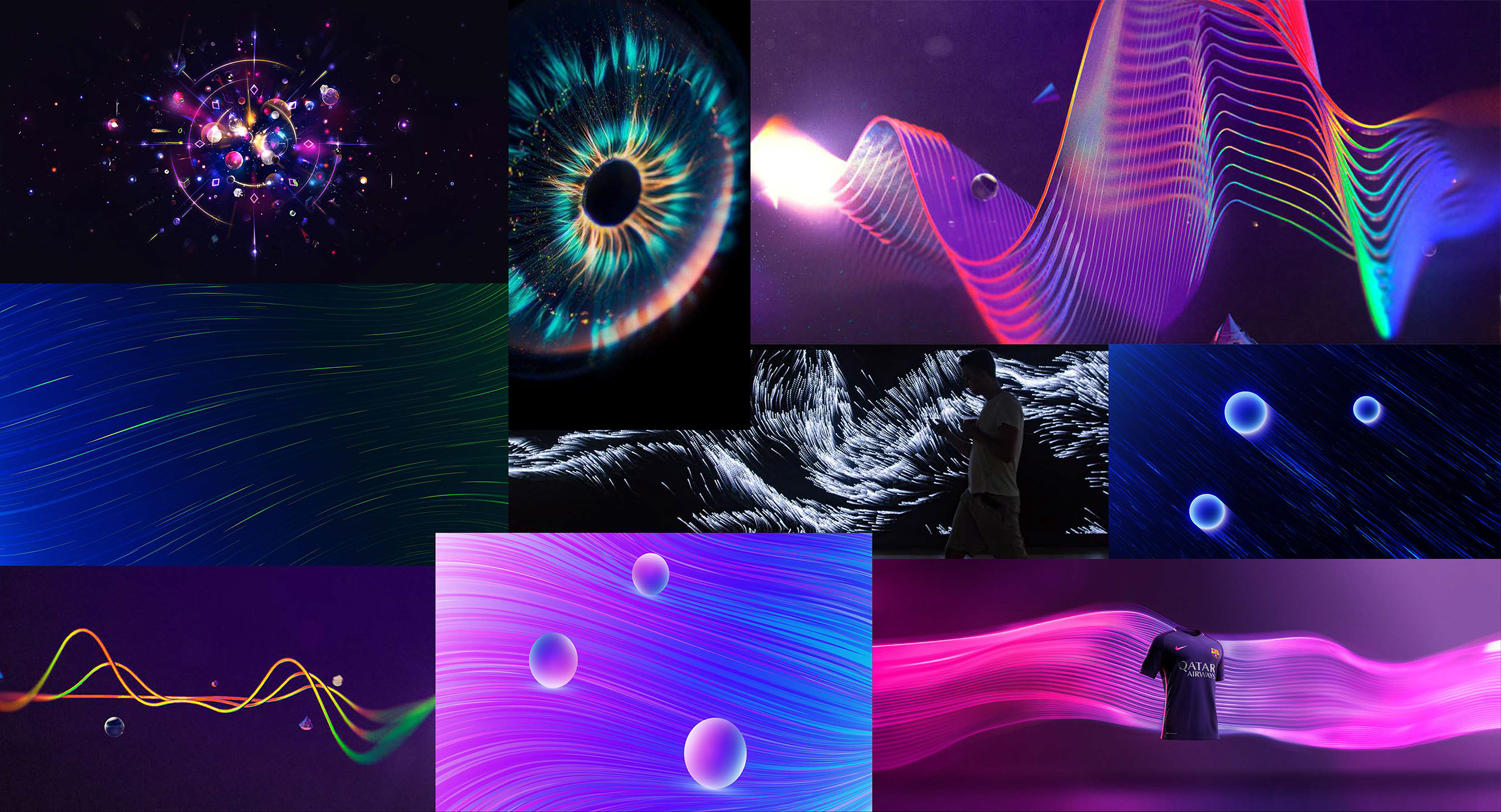
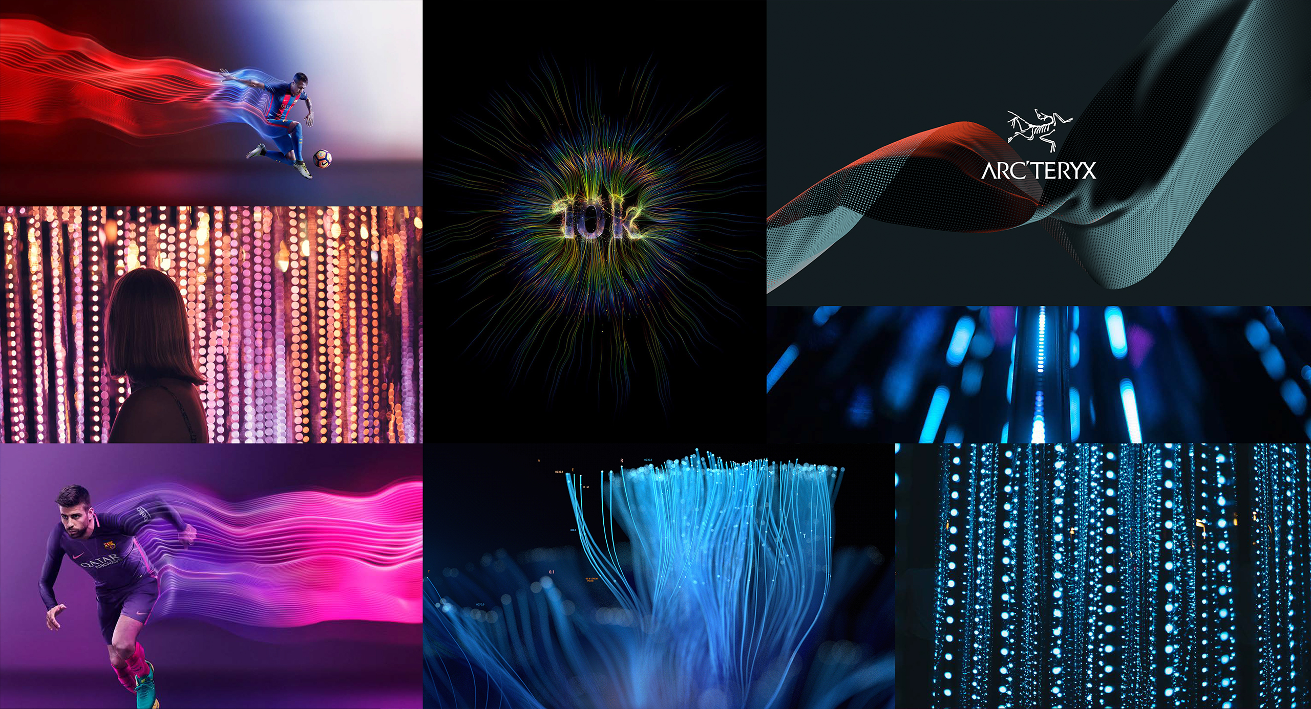
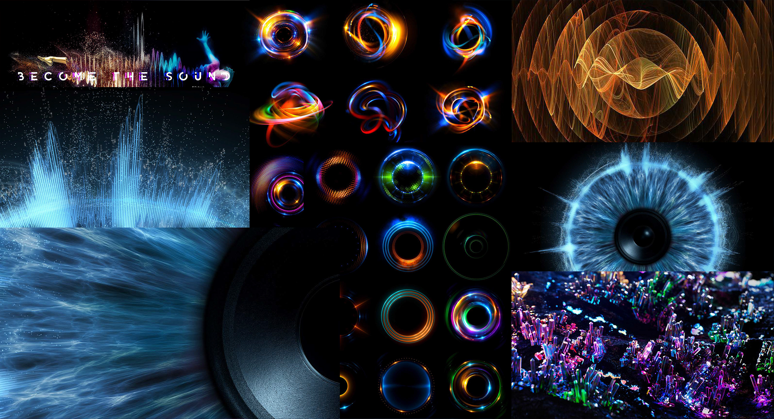
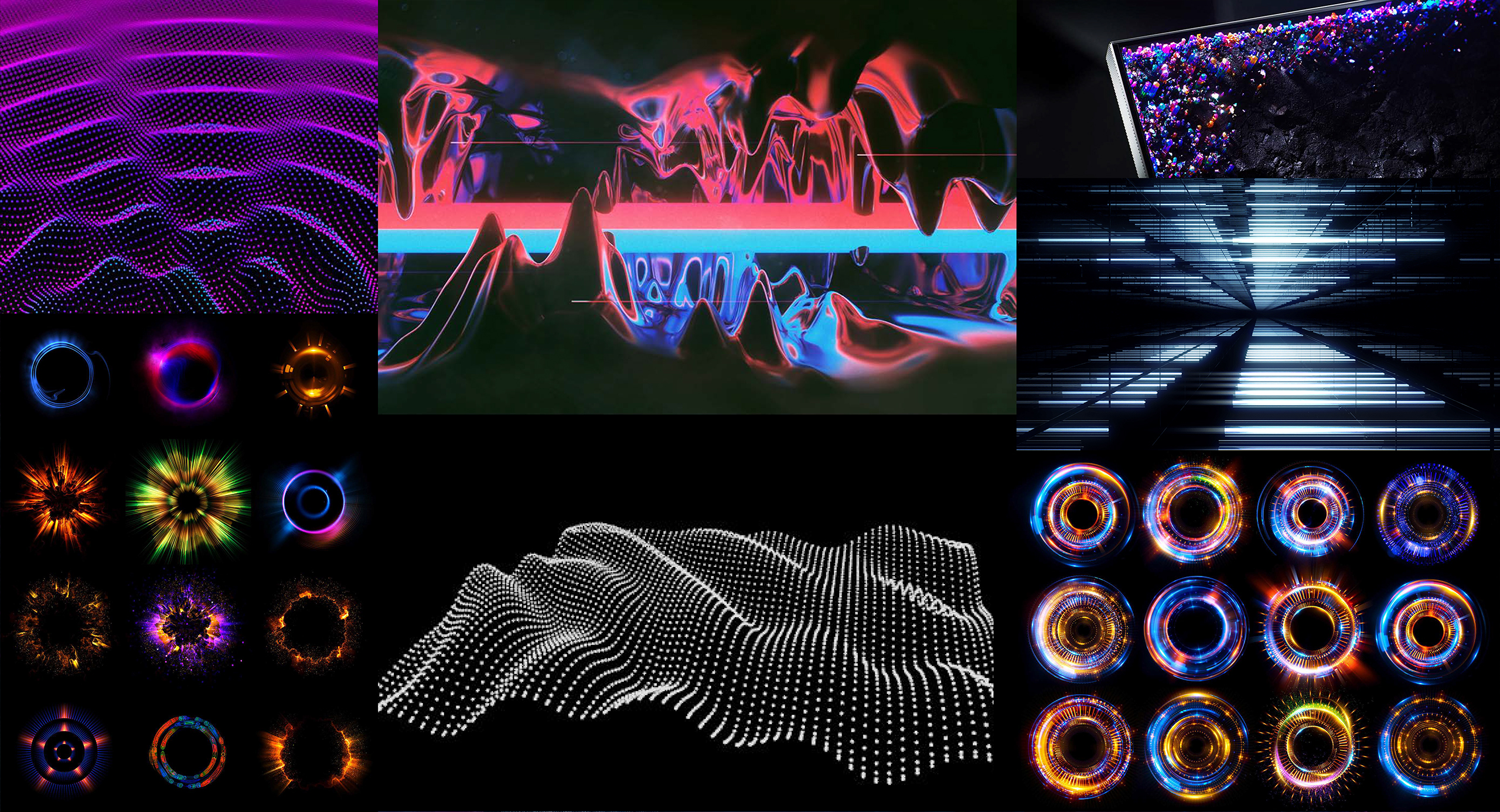
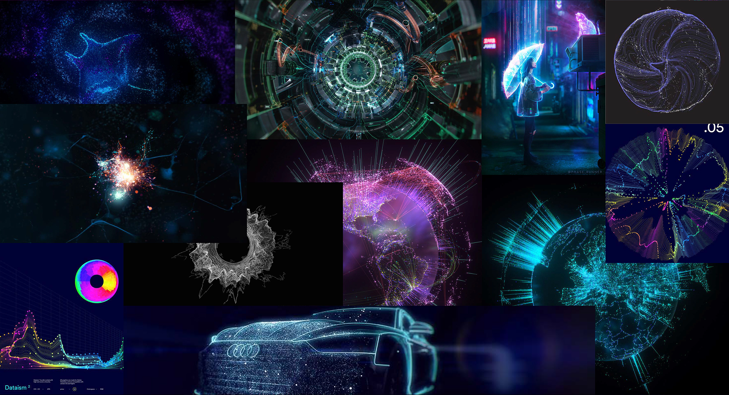
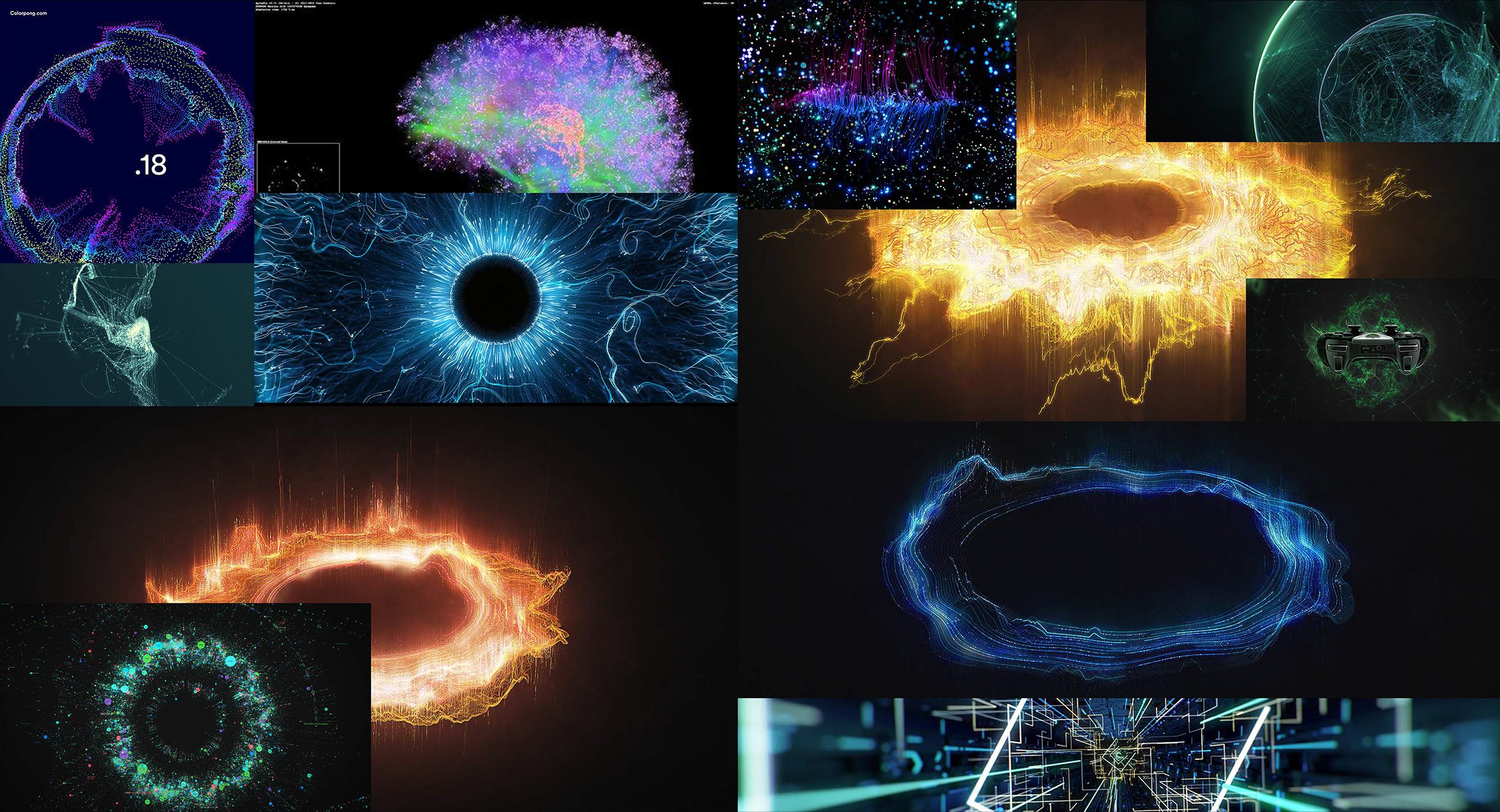
Luckily there were a lot of similarities from the start. This made the entire process a lot easier. After going over the mood boards on a zoom call, it was time to open up Photoshop and start going crazy. From the start, I knew I wanted to create something colorful and abstract where the goal was to capture the vibe of the brand, no pun intended. I also knew that I did not want to use any stock images or 3d renders. This entire thing had to be made from scratch. I was hired to create 1 key visual but decided to work on 4 at the same time. Why? I knew the process of creation was going to become very detailed with lots of little steps. Should Ivan and the V+L team ever decide they would like to acquire more similar images, I would have 3 backups ready. The process of working on all 4 at the same time can be seen in the timelapse video. In this blog post, I’ve decided to only showcase 1 image of each iteration.
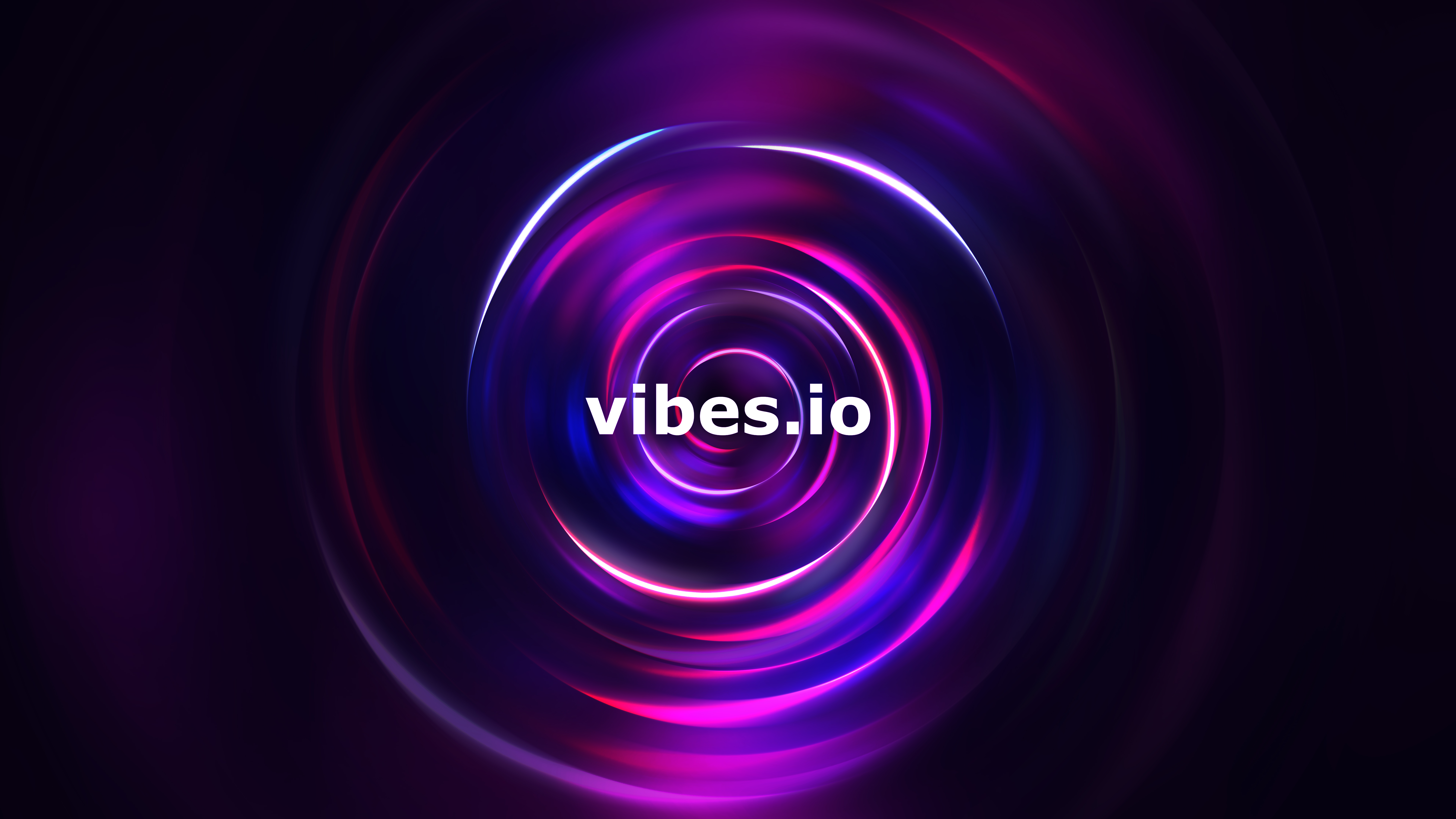
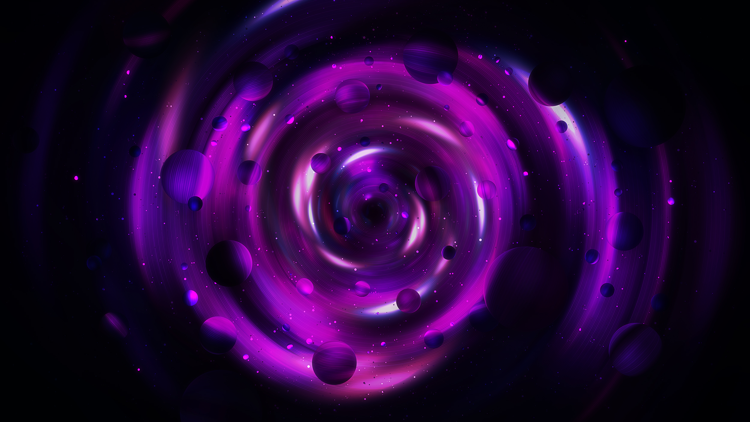
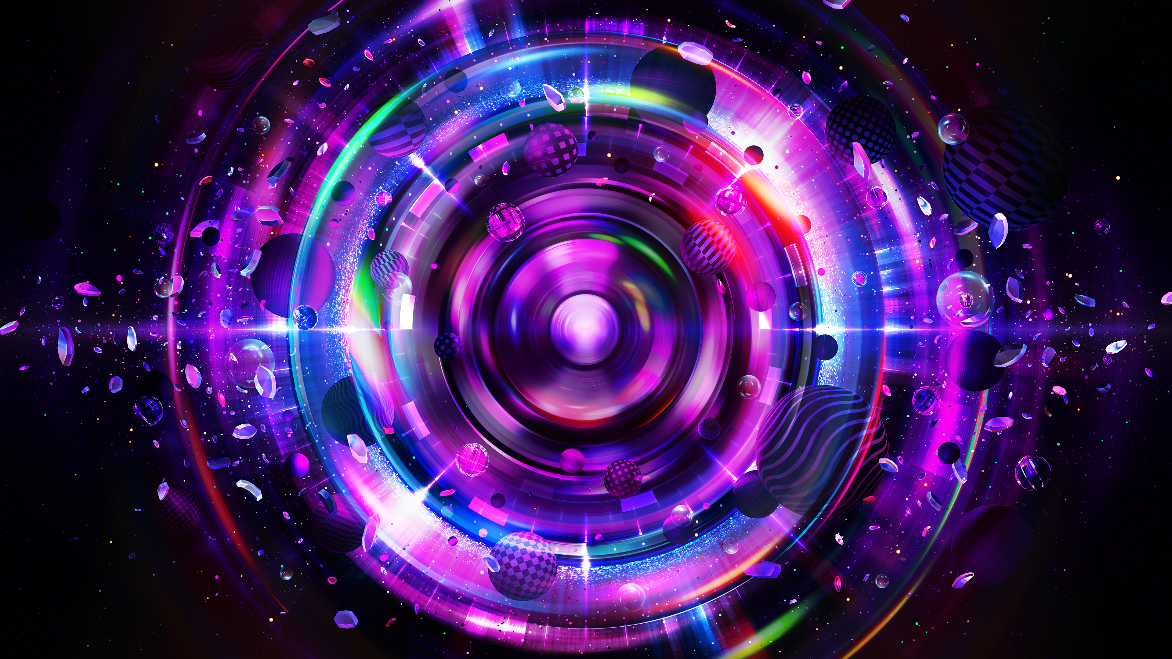
In total, there were going to be around 3 rounds of revisions. I never expect anything to be perfect straight away and I always like involving my clients in the process. They are the ones who will be using the images for a long time, and I want them to use my creations with pride. The first drafts were going in the right direction, but I did have to make a couple of minimal changes as it started to look a bit too much like a galaxy, with planets floating around the center. Instead of making it look like the round objects were being sucked into the center spiral, I figured it would be better to create more outwards movement. The core of the visual would represent the music, and every element around it would represent the lights being moved by the artificial intelligence and the soundwaves.
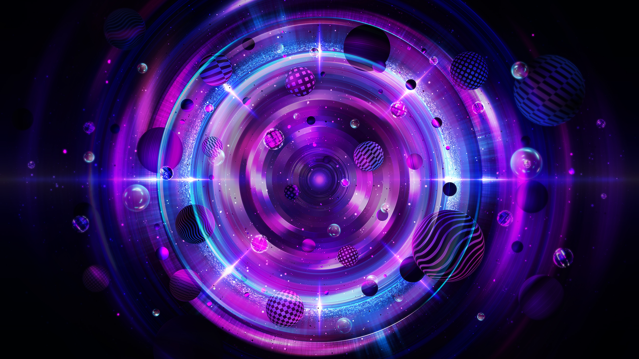
The feedback after this round was very positive. We tackled the problems discussed after my first proposal and we were moving in the right direction. I still had so much in mind that I wanted to implement. I basically told Ivan and Christine, “I’ll keep you guys posted, I have some really dope ideas for this visual and the next update will be a lot more detailed and crazier than this one.”
The next update indeed was crazy and way more detailed than what I had previously shown. I created hundreds of little diamond elements to spread around the visual, representing the crystal clear sound and precise control of the lights. These elements added a certain sharpness the visual had been lacking thus far.
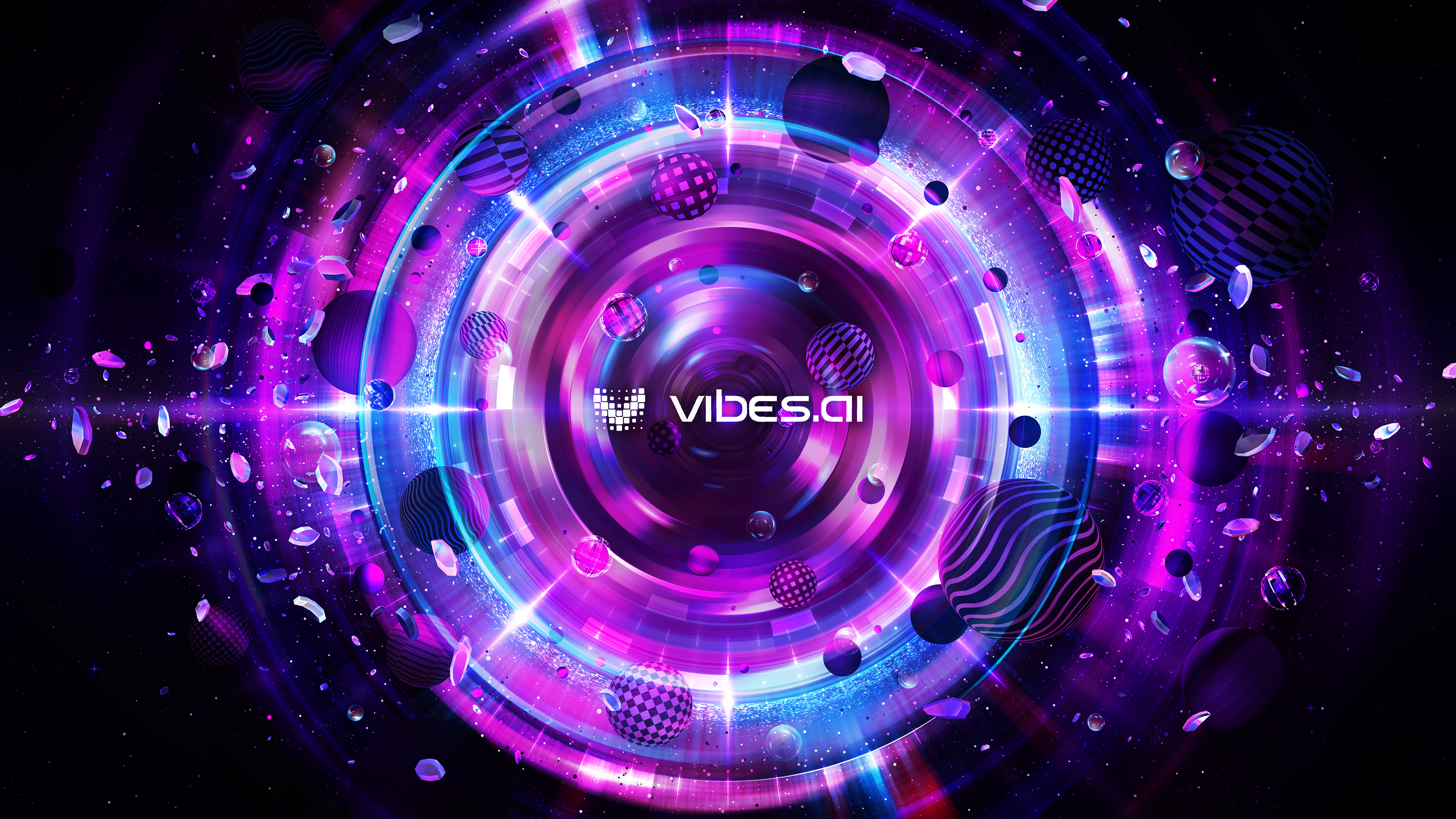
From here on out, there weren’t going to be any major changes except for adding some crazy neon colors. These colors were essential because the V+L software will be able to display lighting using all colors of the rainbow, based on a user’s preferences and their music selection.
Below you’ll see some of the custom radial shapes I created with rainbow colors inside them to create awesome light effects within the visuals.
-jpg.jpeg)
The Vibes team and I also discussed the idea of adding a subwoofer / bass / speaker in the middle of the visual in an abstract way. Then it wouldn’t be too obvious, but people would still be able to recognize it after looking at the image for a while. This part of the process took a while to get right, but in the end, I found a way to add this element to the center of the visual without it becoming too distracting and obvious. We went through a couple of variations but none of them looked perfect. The placement of the speaker looked a bit awkward in these.
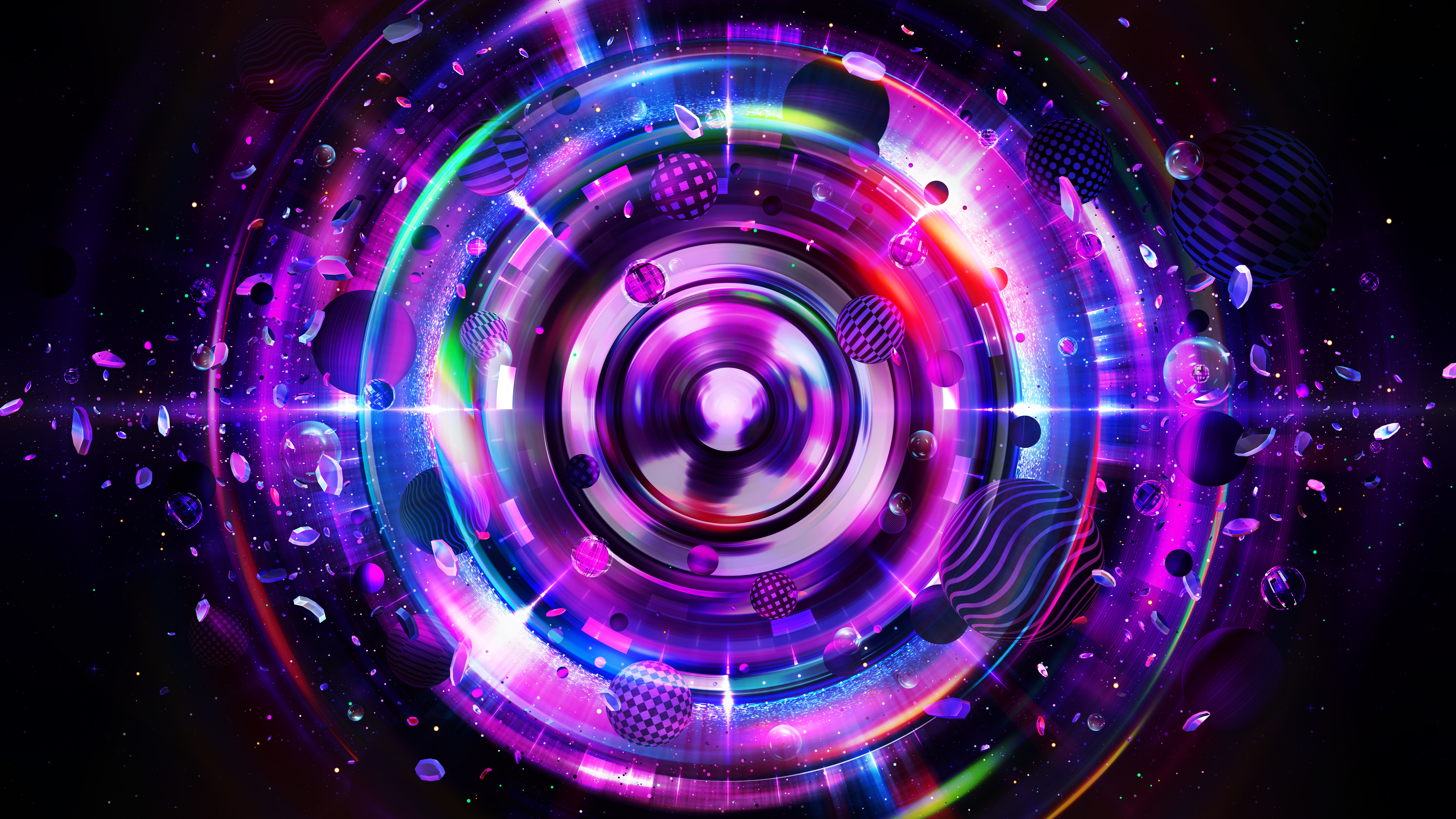
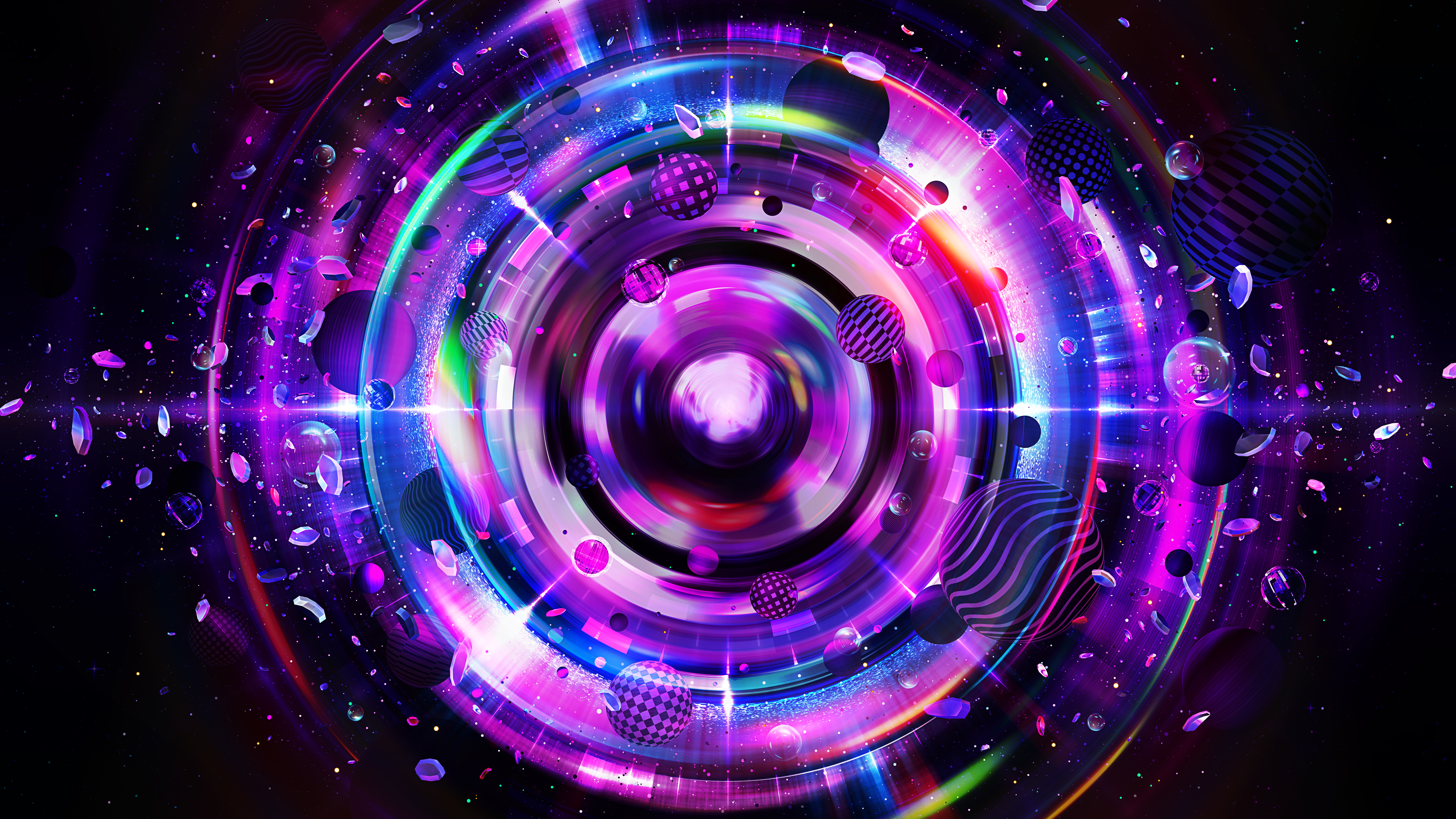
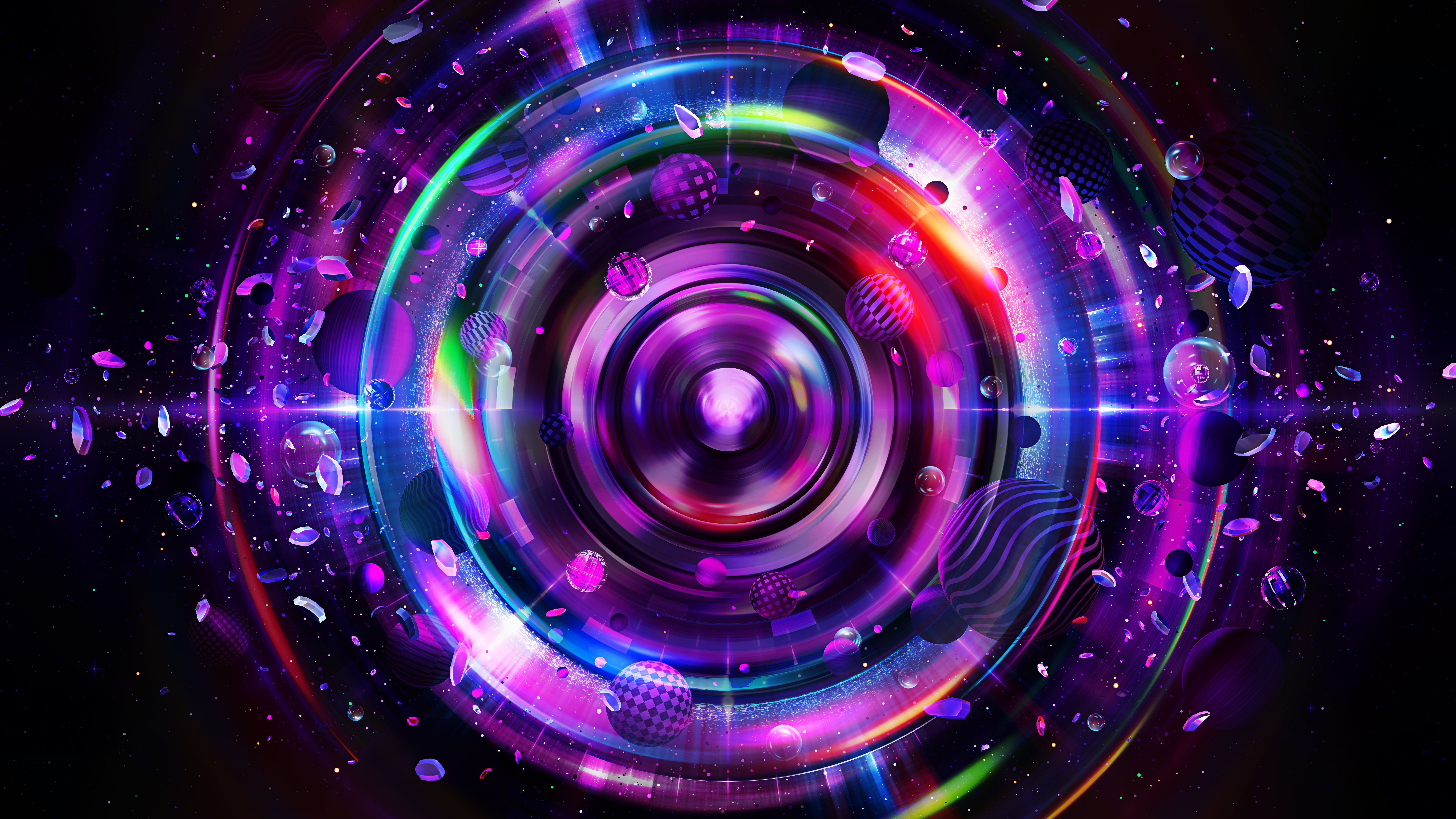
The speaker in the middle needed a little bit of tweaking so we ended up doing a couple of iterations. We ultimately found a way to make the speaker suit nicely without it being too distracting.

I’m extremely happy with the final result and glad the Vibes team also really liked the key visual. Thanks again to Ivan and Christine for the support throughout the project and for giving me the feedback that was needed to create something that perfectly “vibes” with their brand
The making of time-lapse video:
Final 4K image below:
